Tuesday, February 7, 2012

Brooke Sheild's greenwich village home


In the March 2012 issue of Architectural Digest, Brooke Sheild's opens the doors to her classic and timeless Greenwich Village home.  Brooke collaborated with one of my favorite interior designers, David Flint Wood, along with MADE architects for the renovation project, and the results are nothing short of spectacular.  Brooke's sophisticated style and love for old-world details is reflected in every room.  It's cozy and inviting, and I want to live in it!  Here's just a little sneak peek.

In the living room, Louis XVI style armchairs and french antiques are balanced by a modern coffee table with a lucite base.  The walls are painted in Benjamin Moore's Chelsea Gray, and highlight two gilded frames that house custom portraits by artist Will Cotton of Brooke's two daughters. 

In the dining room, antique french side chairs surround a marble topped table by Ralph Lauren.  The wide plank floors are stained in Sydney Harbour Paint's Palm Beach black.

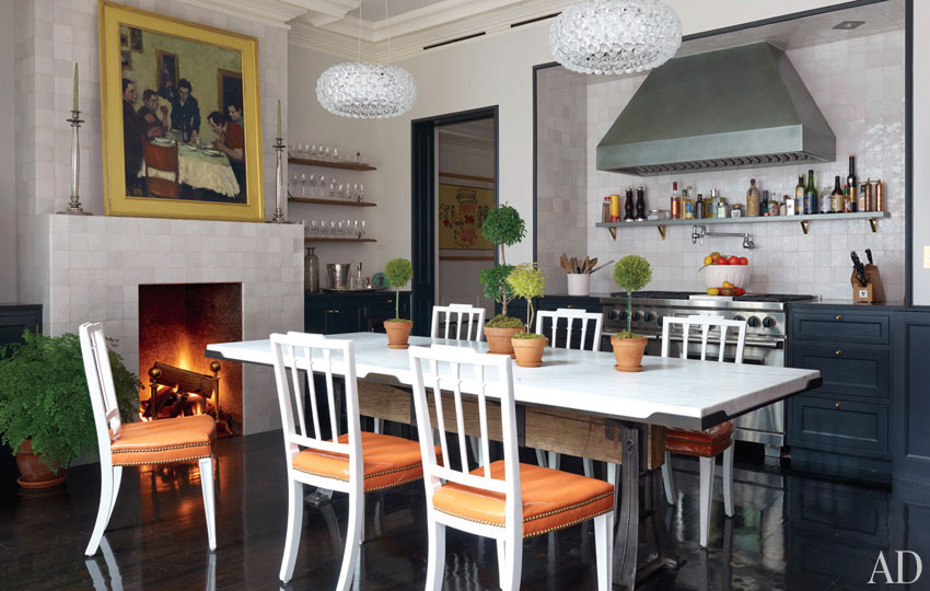
In the kitchen, two modern crystal pendants hang over a custom table from MADE architects, and George III nailhead dining chairs.  The wolf range and chimney breast are covered in shimmering and light catching mosaic tile from Mosaic Del Sur.  The painting is by Malcolm Liepke.

The bathroom features a custom made walnut and lucite vanity, a hand-restored french antique tub from The Bath Works, and Walker Zanger Calcutta marble flooring.  It has a very elegant and romantic feel to it, don't you think?

Isn't her home gorgeous?  I'm anxious to see the entire issue when it comes out next month!

Friday, February 3, 2012

Thursday, February 2, 2012

Lonny sneak peek


Lonny Magazine has published a sneak peek of their upcoming March/April issue featuring the darling designer Anna Burke.  As usual, it did not disappoint.  Just take a look at these beauties.

I could definitely spend all day in this chic workspace.  It has glam written all over it.

This contemporary black and white living space is sleek and sophisticated.  I love the pair of roughed up leather ottomans and the texture they add to the room.

I am in looove with this nursery.  The color palette, the graphic art, and clean lines are to die for.  It's simple and charming.

Now that bold floral wallpaper definitely makes a statement.
And isn't that quadrille kazak upholstered headboard gorgeous?  Come on.

Drooling yet?  I don't know about you, but I can't wait to see more!

Wednesday, February 1, 2012

Styling 101: coffee tables

 Phoebe Howard, interior design extraordinaire, has a new monthly advice column in Southern Living magazine called, "Dear Mrs. Howard".  In the column, she offers her design expertise and helps reader's solve their most difficult design dilemmas.  


via

In their November 2011 issue, Phoebe gives us her expert tips on how to arrange a coffee table, eliminating all of the guess work.  With her simple four-step styling formula, you really can't go wrong.


Here are a few examples that illustrate Phoebe's styling formula

via

via

via
 
via

via

via

via

via

via

via
To read the full article go here

Thursday, January 26, 2012

Double up

I grew up in a little two-bedroom house on beautiful maple tree-lined street.  As you can imagine, space was limited, so we as kids always shared a room.  I really loved sharing a room with my younger brother, and have some very fond memories of those childhood years.  Our room was scarce on square footage, but we seemed to love the coziness of being together in close quarters.  Our two little twin beds were situated in an L-shape, which made it very convenient for me to kick my brother's bed during the night when I was afraid.  It was the perfect set up.  For me anyway.  

This got me thinking about shared children's spaces, and maximizing every little square inch that you have available.  A children's space should not only be functional, but also fun, and inviting - a place to create and at the end of the day, a place to rest from a hard day of play.  These shared children's spaces prove that you really can have it all, and do it without skimping on style. 


If you're really short on space, bunk beds are a great option.

Love the contrast between the red and deep turquoise walls in this bunk room

Why not add some curtain panels for a little extra privacy?

This little bunk bed is perfect for a captain and his first mate.


Love this netting in place of the traditional wooden rails.

How can you go wrong with tangerine? After all, it is pantone's color of the year.


 For long, narrow spaces, beds can be positioned up against the wall.

These built in beds are so fabulous.  I love the contrast of the deep blue against the white.

A vertical stripe tricks the eye, and gives the illusion of more space.  A set of drawers centered between the beds helps to define and separate the two spaces.


Now this is the ultimate in luxury chic.


The traditional side by side

This shared boys and girls room has always been one of my favorites.  It's very sophisticated, yet casual.

I love the calming sophisticated look of this boys room.


I love these industrial pipe beds on casters, and that vintage yellow lawn chair. 


*for a full image source list go here

Related Posts Plugin for WordPress, Blogger...
COPYRIGHT OF ANGIE HELM INTERIORS 2009. Powered by Blogger.
È